Thank you to those who have left kind comments on my blog about my recent design tweaking. I don't have time to write up some of my recent recipes so am indulging in another introspective post about the blog. I thought I'd share the history of my blog designs and a few reflections.
I don't spend money on my blog (other than on photography and food) so my design is the result of my limited technical skills. The above photo is the design on my blog for the first couple of years. It took me that long to work out how to upload a banner photo.
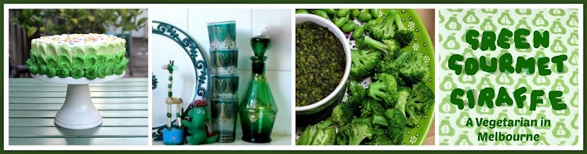
I was very excited when I first worked out how to put a photo on my banner. And colour. You can probably see that I love green. As with most of my changes on my blog, it happened through playing around with the Blogger templates when I had a bit of spare time and chancing upon what I wanted.
Then just recently I came across the new Blogger templates and started tweaking again. Once my banner was up, my new aim was to get some background on the sides. The above picture is an approximation of the design I chanced upon. I sort of liked it but it just wasn't me. In particular I wasn't happy about white print on black background, which seems harder to read.
I have recently read a Gerry McGovern article saying that "
redesign is out, continuous improvement is in". (If you have an interest in hearing up the latest thinking on websites, I'd highly recommend subscribing to
Gerry McGovern and
Jakob Nielsen's newsletters.) In this piece it advises against radical change because people don't like change. This article made sense of why I felt uncomfortable every time I saw my new image.
So I returned to my old image and updated it. I love the backgrounds on the page tabs and posts. I love the look of the
Shabby Blog backgrounds. I have tried a few other side patterns but they were all too bold and took the eye away from my blog. That seemed wrong. So I am staying with the more subtle dots for now.
However I am not sure about my colours. They are in the ball park but I have been tweaking them. I got even more confused when I checked them on my work computer and the hue was different than at home. So I am not even sure what colours you are seeing when you read this.
So for those who are wondering if I will keep trying on new blog outfits, the answer is no. I may continue to make small changes to the design, especially the colours. My big dream now is to fix the position my blog banner which is too low and needs to be in the centre. There is always something! But it will be baby steps, as always. After all, people, continuous improvement is in!
Update: February 2012 - I have updated the design again so at least my banner fits across the page.
Update: July 2012 - I removed my shabby blogs wallpaper and replaced it with one from Blogger as I had read some bad things about shabby blogs! The problem with changing the Blogger background wallpaper is that it then resets all the other fonts and backgrounds which means they all need to be customised again! May still look out for other wallpapers but this will do for now.
More screen grabs (photos) of design changes at
Drop Down Menus and Blog Changes (July 2013).
April 2014: I have done away with the background wallpaper and have a new clean modern look. See above.
August 2014: I updated my banner for the first time in 2 years. I have kept some of the previous banner in it.
This blog is archived by the National Library of Australia's
Pandora archive. You can see previous styles there.


Fun post! I love your new banner. It's very YOU.
ReplyDeleteWell done Johanna and that's great that you've done it all yourself too!
ReplyDeleteHi Johanna, believe me, I have the same technical issues and more. I like my new blue template better than the old one though. The banner was a huge challenge for me!
ReplyDeleteI like this one. . . the white is very clean looking and there aren't too many background distractions to pull us away from the writing and photos. Nice choice! :)
ReplyDeleteIt looks good Johanna. Nothing wrong with baby steps. I find it such a time consuming thing trying to tweak the blog to how I want it to look without the necessary technical no how (that I REALLY don't have).
ReplyDeleteContinuous improvement is all good!
Thanks Joanne - yes I feel comfortable with the banner
ReplyDeleteThanks Lorraine - it is amazing how much I have managed by myself - though I feel there is still much to do
Thanks Cakelaw - nice to know I am not alone in grappling with technology - feels great to get a banner up!
Thanks Ricki - so many ways to distract, that it is hard to ignore them but I guess the best design is one that you don't even notice
Thanks City hippy farm girl - oh yes baby steps is me! some people seem to start a blog with everything in place but I started blogging with very little knowledge of what I needed and so the blog is growing with me as I learn
I'm seeing various shades of green and I really like it. Green is restful on the eye. Don't really like white writing on a dark background - agree too hard to read. I still haven't worked out how to put a banner on my blog. I tried it once and it all went horribly wrong, so I gave up. Your banner is great - really distinctive and reflects the title of your blog. Interestingly my kitchen is red or at least lots of the bits and pieces are red. I have the same scales as you, but red ones.
ReplyDeleteI do like the dots and the tabs too. If you go on to new templates does it change things like your kayout or can you keep everything the same and just add bits like the tabs? I was nervous of having a go. Can you switch back or are you stuck with it when you select it?
ReplyDeleteTry extending your banner with a white border to fit the width of your blog, so you can center it without making it bigger.
I love the new design of your blog! :) I know what you mean about the colours looking different on other computers. When I used to check my website from school it looked terrible but I like how it looks from my home computer.
ReplyDeleteI love the color of your lay out and s with the design.
ReplyDeleteInkjet Paper